UAS Website Redesign — Creating Clarity in a Technical Industry
UX/UI Design · Website Planning · WordPress CMS · Industrial B2B
Transforming a complex industrial service into a clear, maintainable digital experience.
Role: UX/UI Designer, Website Planner
Industry: Gas Processing & Industrial Equipment
Date: Jan - Jul 2019
Link: United Air Systems
Background & Challenge
In 2019, I was invited to redesign the corporate website of UAS, a trading company specializing in nitrogen gas processing systems and industrial equipment.
The challenge revealed itself quickly:
No defined requirements or content direction
No reusable legacy content
A wide user spectrum, from beginners needing conceptual guidance to experts seeking specs
A technically complex domain, new to me
My task became clear:
Create order within ambiguity and build a website that communicates expertise with clarity.
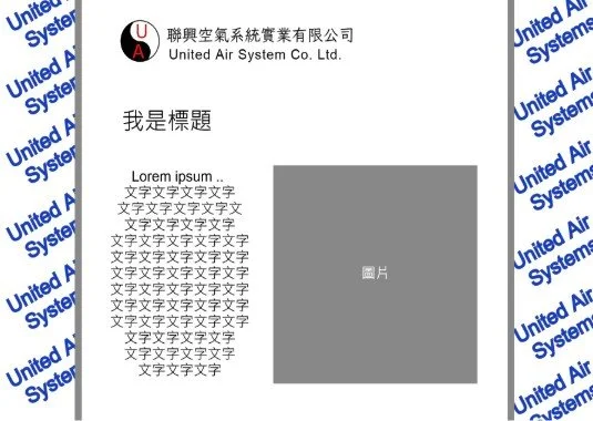
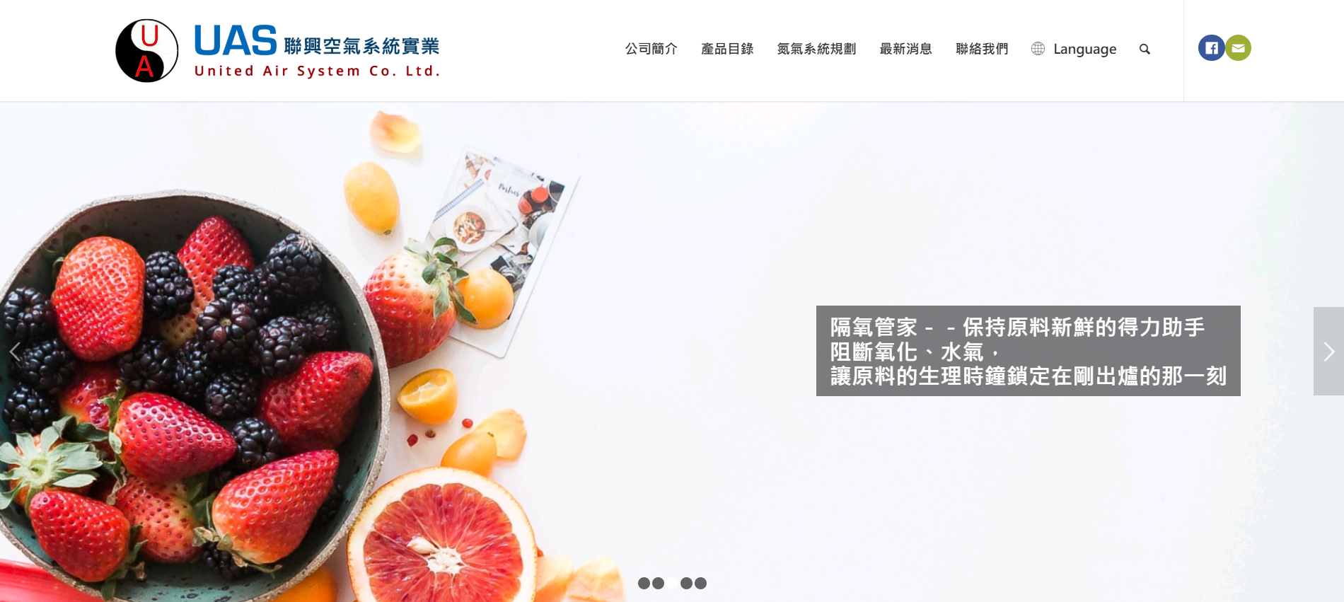
Diagram of Origin Brand Website of UAS
Understanding
To navigate an unfamiliar domain, I focused on understanding both people and content preference.
(1) Stakeholder Interviews
I interviewed sales managers, those closest to customers, and learned:
Common questions and misunderstandings
How clients make decisions
What information matters most (specs, applications, installation conditions)
The need for a website that could also support sales demos
(2) Competitive Review
I analyzed competitor and industry websites to identify:
Standard content structures
How technical information was typically presented
User expectations for similar platforms
(3) Content Audit
The previous website struggled with:
Confusing navigation
Dense technical language
Lack of information hierarchy
Hard-to-maintain backend
(4) User Journey Mapping
Based on interviews, I mapped two clear user types:
Beginners who need conceptual explanations
Experts who only want specifications
This differentiation drove the new IA architecture.
Key Insights
The knowledge gap is wide; content must be layered.
Navigation complexity blocks users from finding what they need.
The website must double as a sales tool, not just a customer-facing site.
Tone of voice must balance expertise with accessibility.
Key Insights
✨
Key Insights ✨
Transform
From Insights to Design
To bring clarity and intention into the experience, I translated insights into a structured design strategy:
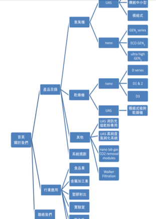
(1) IA Restructure
I created a two-path content structure:
For beginners:
Bullet-based explanations
Applications and benefits of visuality
Simplified terminology
For experts:
Detailed specifications
Installation requirements
Product comparison
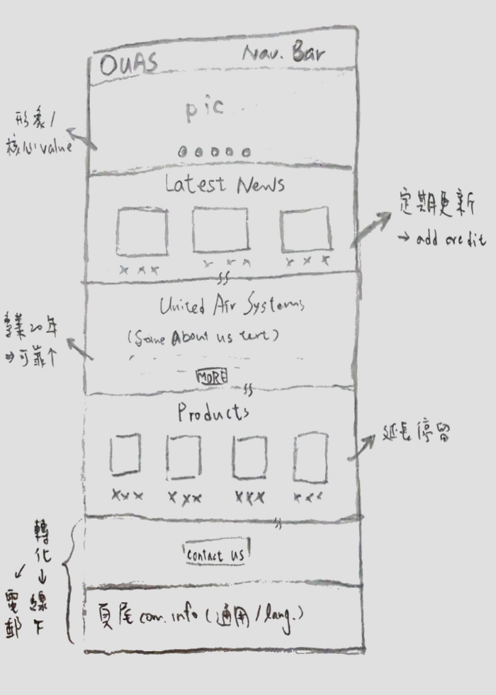
(2) Flows & Wireframes
I designed flows and wireframes emphasizing:
Simplified navigation
Modular content sections
Clear separation between foundational and advanced information
(3) Tech & CMS Strategy
WordPress was selected because it offered:
Modular, scalable content management
Lower long-term maintenance cost
Compatibility with the project budget
(4) Design Principles
Information clarity over decorative aesthetics
Support both beginners and experts
Every component is designed to communicate or support a user decision
Wireframes & IA Visual
Iteration
Usability Testing at a Trade Exhibition
After the first version launched, we conducted in-person usability testing at a major industry expo, collecting insights from ~8 participants.
Key findings:
Beginners found the content easier to understand
Experts quickly located specs
Sales teams started using the site as a live demo tool
These findings guided the refinement of copy and content hierarchy.
“I finally understood what the company actually does within a few seconds.
The structure made it easy to grasp, even without a technical background.”
“The website became a practical sales tool.
We could clearly explain our products without spending extra time clarifying basics.”
“This iteration taught me that good structure reduces cognitive load — not only for users, but also for the teams who rely on the product.”
Final Experience
Product Page Design, Before
(Click to see whole picture)
Bullet Points but visually no focal points.
→
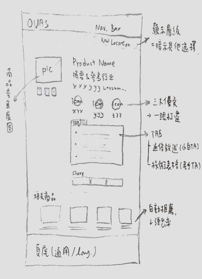
Product Page Design, After
Icons highlight key features, and tabs hide expandable technical information to maintain visual cleanliness.
A clearer, more intentional interface supporting both comprehension and efficiency.
Impact
✔ Delivered on time and within budget
✔ CMS improved long-term maintainability
✔ Homepage bounce rate decreased by ~20–30%
✔ Increased usage by internal sales teams(qualitative feedback)
Reflection
This project shaped my approach to UX in a lasting way:
Design is the discipline of transforming complexity into clarity, and ensuring the experience remains human, intentional, and supportive.
Make a Contact Today
Want to learn more about my design?